Poparide has a new look
By the Poparide Design Team
Have you noticed Poparide looks a bit different these days? We’ve recently given our brand a fresh new look to allow us more creative space to grow our community. We’re excited to share these updates with you and how it all came together.
Since travel restrictions have been lifted in Canada, demand for Poparide has come roaring back and reignited our business. Over the past several months our team has expanded with new talent, explored opportunities for growth and reflected on where we want to go.
During this time, we took a hard look in the mirror. By pausing and reflecting, we were able to think about how to present ourselves as a leading brand in the tech transportation space.
We had a lot of thought provoking conversations about how effective we were at communicating non-verbally, which resulted in an important discovery: that we needed to evolve our look to better convey what Poparide represents today and where we’re headed.
To explain why we made these changes, we wanted to share our creative process and how we arrived at our new look.
Before you read further, make sure you download the latest version of our app on iPhone or Android or visit our new website!
Did our visual identity still represent our brand?
We always knew that our visual identity was an important part of our success, helping us reach our audience across Canada. But when we looked closer we realized that our identity was looking outdated.
The travel market was evolving, our organization had grown, and we found ourselves questioning the language of design we were using to represent our brand. We came to realize that we were simply not translating our fundamental message: that Poparide is a simple, convenient and fun way for everyone to travel together in Canada.
At the time we were already working on improving how we communicated in writing, but that wasn’t enough on its own. We needed a visual way to articulate how easy-to-use and ubiquitous Poparide is. We needed a way to represent how our members could go virtually anywhere with ease and meet all kinds of people—and in doing so, portray the other benefits of Poparide, including reducing traffic congestion and carbon emissions.
Such important messaging required a new identity that everyone could easily relate to and understand. It needed to have an impact the moment they first discovered us, so we decided to take a giant step back to the beginning and review the visual aspect of our brand.
With fresh eyes, we seeked new meaning
Most design teams would agree that reassessing a visual identity is no easy task. The hardest part is often detaching yourself from your existing look, especially when your team created it in the first place.
So we started out by going back to the basics: we took a look at our vision and mission with fresh eyes and asked ourselves how well our brand was representing our core ideas.
“Our vision is a world where the sharing of resources is ubiquitous and leads to long-term environmental preservation.”
“Our mission is to fill empty seats in cars and make travel more social, affordable and sustainable for everyone.”
This was the perfect starting point on how to make improvements to our look in order to better communicate these messages.
It was an exciting time and we knew we had a lot of work ahead.
Our moment of discovery
Our design team knew that our visual identity is what makes a strong first impression, so we had to get it right. It plays an important role in motivating new audiences to engage with our brand or leave us behind.
With this understanding, we set off to examine each component of our visual identity and ask ourselves how they contributed to telling our story. This was a critical step in our exploration process in deciding how to evolve our look and feel.
After lots of discussion and thought, here’s what we discovered…
We loved our logo
The Poparide logo is one of our favourite parts of our visual identity. It is highly recognizable and just works.
Our members continue to tell us that they see Poparide everywhere they go, whether it’s on the bulletin board at university, a bicycle helmet, on giveaways like hats or sunglasses, or sometimes in unlikely places, like the carousel at a chairlift in Whistler.
![]()
We loved the simplicity and fun feeling of the bold orange lettering in our logo, plus the image of a steering wheel incorporated into the letter ‘O’.
Since we knew our logo was still working, we decided to keep it as the primary asset for our brand and improve other parts of our visual identity.
We had too many words and not enough pictures
Using white space in our design has always been part of our strategy. It denotes simplicity and modernity which are two traits that are fundamental to our brand, so we decided to continue to maximize white space wherever possible.
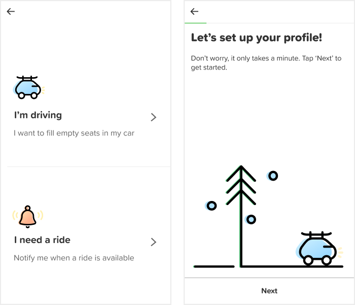
Even though we made good use of white space, it felt like we were still too reliant on written words to get our message across. This made our UI look slightly cluttered and less effective in portraying the true sense of simplicity inherent in our app experience, prompting us to make some changes.
Our new look has fewer words and more pictures to help improve usability while emphasizing stronger ties to our vision and mission statements.
Our graphics were too detailed
When we took a close look at our graphics, we found that the illustrated characters were too detailed. On a subliminal level, it felt like these detailed characters were generating a sense of complexity that was contrary to our messaging. This also made it impractical to use them in other areas, such as our app, website, videos, digital ads and printed materials.
After careful consideration, we decided that we needed a new illustrative style that would convey the simplicity of using Poparide.
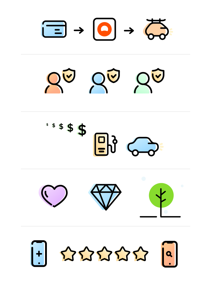
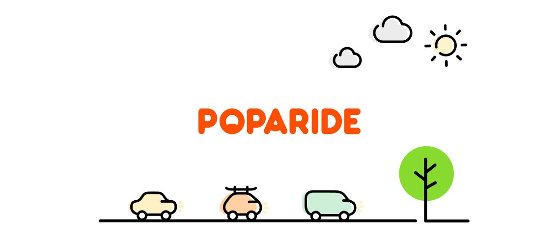
Our new illustrations are drawn with broad line strokes and offset shapes to make them more fun and relatable.
This simplified style lends itself well to animation, allowing us to add motion to our brand and do cool things like representing people moving around in cars.
We wanted to humanize our brand
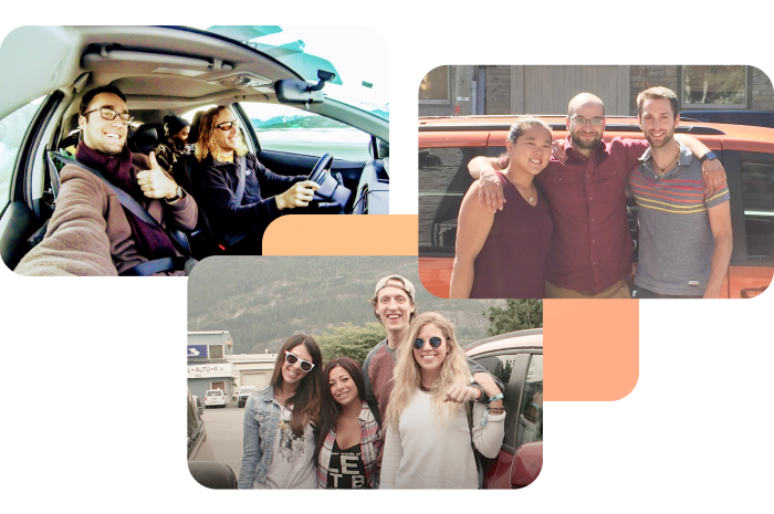
Poparide brings people together in real life which often creates long lasting connections, yet our brand was missing that human element which is fundamental to building a community.
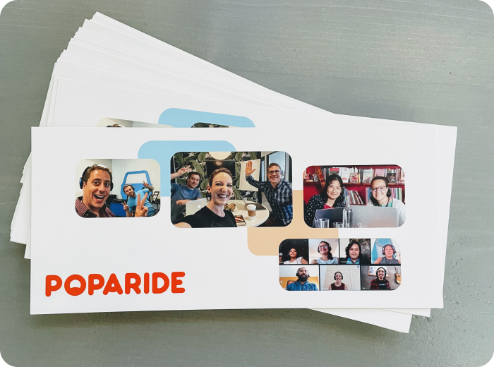
To make our brand more relatable and engaging, we decided to add real pictures of our members when they are using Poparide. This helps us create an authentic connection with our brand and engage with our members to collect and showcase their experiences, which ultimately builds a greater sense of trust and community.
We also added pictures of our team to show the people behind the scenes and build a more human connection with our members.
Our font wasn’t quite right
We also decided to change our font to look less corporate and more friendly and consumer-oriented.
The new primary font is Proxima Soft which is rounded and easy to read. It makes our communications look more approachable and relatable to younger audiences.
We’ve also introduced a secondary handwritten font called Sriracha to make certain typographic elements stand out and appear more young and friendly. This typographic trick of sporadically using a handwritten font also helps us be more human.
We needed to use colour more strategically
Our previous colour palette was limited to our core orange with minimal use of accents such as blue, yellow, black and white.
When we originally introduced this palette we wanted to gain stronger brand recognition, so we emphasized the bold orange as a key element in our overall design. Orange was eye-catching and helped us stand out as a confident brand as we worked to establish our name in the marketplace.
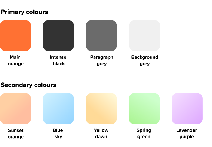
Now that our brand is well known, we decided to keep our core orange and introduce new pastel gradients to soften our look and make the brand more approachable.
The new pastels represent colours that our members might see while on the road, such as blue skies, orange sunsets, yellow dawn, or spring green—all of which are things we can relate to no matter where we are travelling.
Having a more diverse palette gave us the ability to pair colour with distinct messages about Poparide, such as simplicity, fun and the connection to the environment. It also allowed us to divide various parts of our app into colour-based sections to make the user experience more enjoyable and intuitive.

Staying true to who we are
When we embarked on this brand revamp, our goal was to retain all of the fun and endearing qualities about Poparide that our members love while creating space for our brand to grow and connect with more people.
Our team worked to identify elements that would help our company stand out, create emotional connections, and keep us top of mind for our members. It was important for us to stay true to our original vision and mission, while at the same time show our members that we were willing to make change and take risks as we grow.
We’re an organization that stands for creativity and respect, and we hope that sharing our process will inspire others to champion their own creativity while staying true to themselves.